Chapter 7 Statistical significance and p-values
This introductory book uses frequentist statistics. Though it isn’t possible to give a detailed description of how this methodology works, we can at least provide a rough indication. In a nutshell, frequentist statistics works by asking what would have happened if we were to repeat an experiment or data collection exercise many times, assuming that the population remains the same each time. This is the basic idea we used to generate sampling distributions of plant colour morph frequency in the last chapter. The details of this procedure depend on what kind of question we are asking, which This obviously varies from one situation to another.
What is common to every frequentist technique is that we ultimately have to work out what a sampling distribution of some kind looks like. If we can do that, then we can evaluate how likely a particular result is. This naturally leads onto two of the most important ideas in frequentist statistics: p-values and statistical significance. The goal of this chapter is to introduce these ideas.
7.1 Estimating a sampling distribution
Let’s work with the plant polymorphism example again. Our goal is to evaluate whether the purple morph frequency is greater than 25% in the new study population. The suggestion in the preamble of this chapter is that, to get to this point, we need to work out what the sampling distribution of the purple morph frequency estimate looks like. At first glance this seems like an impossible task. If this was a real problem, we can’t use simulations because we don’t know the true frequency of purple morphs in the population. We only have access to a single sample.
The solution to this problem is surprisingly simple: since we don’t know much about the population, we use the sample to approximate some aspect(s) of it, and then work out what the sampling distribution of our estimate should look like using this approximation. We’ll unpack this idea a bit more, and then try it out for real.
7.1.1 Overview of bootstrapping
There are many different ways to approximate a population from a sample. One of the simplest methods is to pretend the sample is the true population. All we then have to do to get at a sampling distribution is draw new samples from this pretend population. This may sound like ‘cheating’, but it turns out that this is a perfectly valid way to construct approximate sampling distributions.
We’ll try to get a sense of how this works using a physical analogy. Imagine that we have written down the colour of every sampled plant on a different piece of paper, and then placed all of these bits of paper into in a hat. We then do the following:
- Pick a piece of paper at random, record its value (purple or green), put the paper back into the hat, and shake the hat about to mix up the bits of paper.
(The shaking here is meant to ensure that each piece of paper has an equal chance of being picked, i.e. we’re taking a random sample.)
Now pick another piece of paper (we might get the same one), record its value, and put that one back into the hat, remembering to shake everything up again.
Repeat this process until we have a recorded new sample of colours that is the same size as the real sample. We have now have generated a ‘new sample’ from our original one.
(This process is called ‘sampling with replacement’. Each artificial sample is called a ‘bootstrapped sample’.)
For each bootstrapped sample, calculate whatever quantity is of interest. In our example, this is the proportion of purple plants sampled.
Repeat steps 1-4 until we have generated a large number of bootstrapped samples. About 10000 is sufficient for most problems.
Although it seems like cheating, this procedure really does produce an approximation of the sampling distribution of the purple plant frequency. It is called bootstrapping (or ‘the bootstrap’). The bootstrap is a sophisticated technique developed by the eminent statistician Bradley Efron. We’re not going to use it to solve real data analysis problems. We’re introducing it because offers an intuitive way to get a sense how frequentist methodology works without having to get stuck into any difficult mathematics.
7.1.2 Doing it for real
No one carries out bootstrapping using bits of paper and hat. It could be done, but generating 10000 bootstrapped samples via such a method would obviously take a very long time. On the other hand, computers are very good at carrying out repetitive tasks quickly. Let’s take a look at how to implement the bootstrap for our hypothetical example using R.
The best way to understand what follows is to actually work through the example. You’re strongly encouraged to do this…
Assume that we had sampled 250 individuals from our new plant population. A data set representing this situation is stored in the Comma Separated Value (CSV) file called ‘MORPH_DATA.CSV’. Download the file from MOLE and place it in the working directory. Next, run through the following steps:
Read the data into an R data frame using
read.csv, assigning the data frame the namemorph.data.Use a function like
glimpse(from dplyr) orstrto inspectmorph.data.Use the
Viewfunction to inspect the data.
Review the following questions: How many observations are in the data set? How many variables are in the data set? What are their names? What kind of variables are they? What values do the different variables take?
The point of all this is to ‘sanity check’ the data, i.e. to make sure that we understand the data. Always check our data after reading it into R. There is no point messing about with the likes of dplyr and ggplot2, or carrying out a statistical analysis, until we have done this. If we don’t understand how our data is organised, and what variables we are working with, we’re bound to make a lot of avoidable mistakes.
What you should have found is that morph.data contains 250 rows and two columns/variables: Colour and Weight. Colour is a categorical variable (a ‘factor’) and Weight is a numeric variable. The Colour variable contains the colour of each plant in the sample. What about Weight? Actually, we don’t need this now—we’ll use it in the next chapter.
Now that we understand the data, we’re ready to implement bootstrapping in R. We’ll use a few new R tricks here. We’ll explain these as we go, but there’s really no need to remember them. Focus on the ‘why’ (the logic of what we’re doing) not the ‘how’.
Our goal to construct a sampling distribution for the frequency of purple morphs, so the variable that matters here is Colour. Rather than work with this inside the morph.data data frame, we’re going to pull it out using the $ operator, assign it a name (plant_morphs):
# pull out the 'Colour' variable
plant_morphs <- morph.data$Colour
# what values does 'plant_morphs' take?
levels(plant_morphs)
## NULL## [1] "Green" "Green" "Green" "Purple" "Green" "Green" "Green" "Green"
## [9] "Green" "Green" "Green" "Green" "Green" "Purple" "Green" "Green"
## [17] "Purple" "Purple" "Green" "Green" "Green" "Green" "Green" "Purple"
## [25] "Green" "Green" "Green" "Green" "Purple" "Purple" "Green" "Green"
## [33] "Green" "Purple" "Purple" "Green" "Green" "Green" "Green" "Purple"
## [41] "Green" "Purple" "Green" "Green" "Purple" "Purple" "Green" "Green"
## [49] "Green" "Green" "Green" "Green" "Purple" "Purple" "Purple" "Green"
## [57] "Green" "Green" "Purple" "Green" "Purple" "Green" "Purple" "Green"
## [65] "Purple" "Purple" "Green" "Green" "Purple" "Green" "Green" "Purple"
## [73] "Purple" "Green" "Purple" "Green" "Green" "Green" "Green" "Purple"
## [81] "Purple" "Green" "Purple" "Green" "Green" "Green" "Purple" "Purple"
## [89] "Green" "Purple" "Green" "Green" "Green" "Green" "Green" "Green"
## [97] "Purple" "Green" "Green" "Green"The last line printed out the first 100 values of plant_morphs. This shows that plant_morphs is a simple vector with two categories describing the plant colour information.
Next, we calculate and store the sample size (samp_size) and the point estimate of purple morph frequency (mean_point_est) from the sample:
## [1] 250# estimate the frequency of purple plants
mean_point_est <- 100 * sum(plant_morphs == "Purple") / samp_size
mean_point_est## [1] 30.8So… 30.8% of plants were purple among our sample of 250 plants.
We’re ready to start bootstrapping. For convenience, we’ll store the number of bootrapped samples we plan to construct in n_samp (i.e. 10000 samples):
Next, we need to work out how to resample the values in the plant_morphs vector. The sample function will do this for us:
# resample the plant colours
samp <- sample(plant_morphs, replace = TRUE)
# show the first 100 values of the bootstrapped sample
head(samp, 100)
## [1] "Green" "Purple" "Purple" "Green" "Green" "Purple" "Green" "Purple"
## [9] "Green" "Green" "Green" "Green" "Purple" "Purple" "Green" "Green"
## [17] "Purple" "Purple" "Green" "Green" "Green" "Green" "Green" "Green"
## [25] "Green" "Green" "Purple" "Purple" "Purple" "Purple" "Green" "Green"
## [33] "Green" "Purple" "Green" "Green" "Purple" "Green" "Purple" "Green"
## [41] "Green" "Green" "Purple" "Purple" "Green" "Purple" "Green" "Purple"
## [49] "Purple" "Purple" "Green" "Green" "Purple" "Green" "Green" "Purple"
## [57] "Green" "Green" "Green" "Purple" "Green" "Green" "Green" "Green"
## [65] "Green" "Green" "Green" "Green" "Green" "Green" "Purple" "Purple"
## [73] "Green" "Purple" "Green" "Green" "Green" "Green" "Green" "Purple"
## [81] "Purple" "Green" "Green" "Green" "Purple" "Purple" "Green" "Purple"
## [89] "Green" "Purple" "Purple" "Green" "Green" "Purple" "Purple" "Green"
## [97] "Green" "Green" "Green" "Green"The replace = TRUE ensures that we sample with replacement—this is the ‘putting the bits of paper back in the hat’ part of the process.
The samp variable now contains a random sample of the values in the true sample. We only need one number from this sample—the frequency of purple morphs:
# calculate the purple morph frequencyin the bootstrapped sample
first_bs_freq <- 100 * sum(samp == "Purple") / samp_size
That’s one bootstrapped value of the purple morph frequency. Simple, but we need \(10^{4}\) values. We don’t want to have to keep doing this over an over ‘by hand’—making second_bs_freq, third_bs_freq, and so on—as this would be slow.
As we said earlier, computers are very good at carrying out repetitive tasks. Here is some R code that repeats what we just did n_samp times, storing the resulting bootstrapped samples in a vector called boot_out:
boot_out <- replicate(n_samp, {
  samp <- sample(plant_morphs, replace = TRUE)
  100 * sum(samp == "Purple") / samp_size
})
The replicate function replicates an R expression many times and returns the set of results. There’s no need to remember how this works.
What have we achieved? The boot_out vector now contains a bootstrapped sample of frequency estimates. Let’s take a quick look at the first 25 values rounded to 2 decimal places:
##  [1] 31.6 23.6 27.6 28.4 32.0 28.0 34.0 28.0 32.8 33.2 34.0 25.2 34.0 30.0 28.8
## [16] 31.6 30.0 30.0 29.2 28.0 31.2 27.6 29.6 30.4 32.8
We used the pipe %>% to make a code a bit more readable—this won’t work unless the dplyr package was loaded.
The numbers in boot_out represent the values of purple morph frequency we can expect to generate if we repeated the data collection exercise many times, under the assumption that the purple morph frequency is equal to that of the actual sample. This is a bootstrapped sampling distribution. We can use this bootstrapped sampling distribution in a number of ways.
Let’s plot it first get a sense of what it looks like. A histogram is a good choice here because we have a reasonably large number of cases:
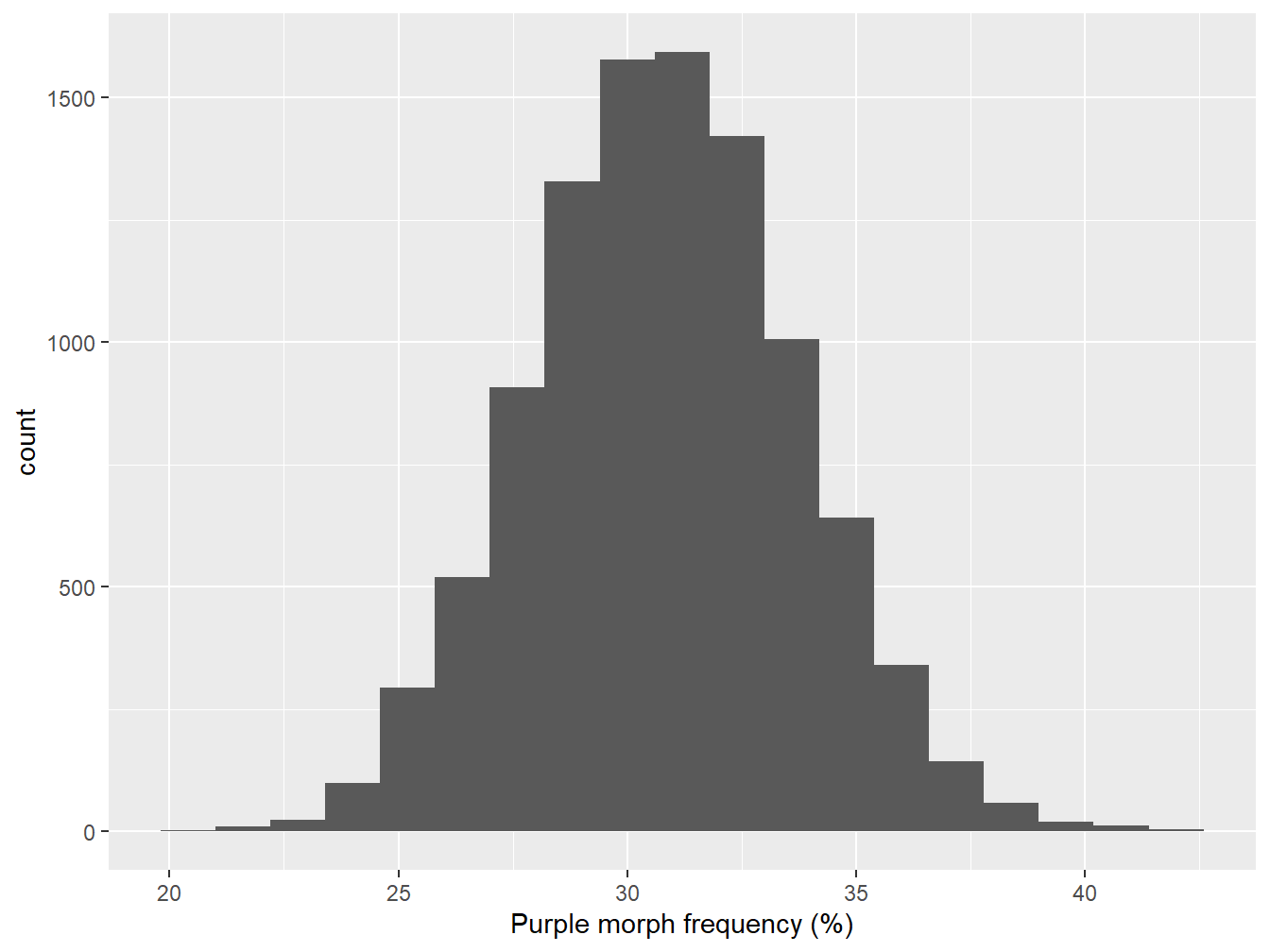
Figure 7.1: Bootstrapped sampling distribution of purple morph frequency
The mean of the sampling distribution looks to be round about 31%:
## [1] 30.8This is essentially the same as the point estimate of purple morph frequency from the true sample. In fact, this is guaranteed to be the case if we construct a large enough sample, because we’re just resampling the data used to estimate the purple morph frequency.
A more useful quantity is the bootstrapped standard error (SE) of our estimate. This is defined as the standard deviation of the sampling distribution, so all we have to do is apply the sd function to the bootstrapped sample in boot_out:
## [1] 2.9The standard error is a very useful quantity. Remember, the standard error is a measure of the precision of an estimate. For example, a large SE would imply that our sample size was too small to reliably estimate the population mean. It is standard practice to summarise the precision of a point estimate by reporting its standard error. Whenever we report a point estimate, we should also report the standard error, like this:
The frequency of purple morph plants (n = 250) was 30.8% (s.e. ± 2.9).
Notice that we also report the sample size.
7.2 Statistical significance
Now back to the question that motivated all the work in the last few chapters. Is the purple morph frequency greater than 25% in the new study population? We can never answer a question like this definitively from a sample. Instead, we have to carry out some kind of probabilistic assessment. To make this assessment, we’re going to do something that looks rather odd.
Don’t panic…
The ideas in this next section are very abstract. You aren’t expected to understand them straight away, and you won’t be asked to explain them in an assessment.
We’ll make two important assumptions:
Assume that the true value of the purple morph frequency in our new study population is 25%, i.e. we’ll assume the population parameter of interest is the same as that of the original population that motivated this work. In effect, we’re assuming there is really no difference between the populations.
Assume that the form of sampling distribution that we just generated would have been the same if the ‘equal population’ hypothesis were true. That is, the expected ‘shape’ of the sampling distribution would not change if the purple morph frequency really was 25%.
That first assumption is an example of a null hypothesis. It is called this because it is an hypothesis of ‘no effect’ or ‘no difference’. The second assumption is necessary for the reasoning below to work. It can be shown to be a reasonable assumption in many situations.
Now we ask, if the purple morph frequency in the population is really 25%, what would the corresponding sampling distribution look like? This is called the null distribution—the distribution expected under the null hypothesis. If the second assumption is valid, we can construct the null distribution in R as follows:
All we did here was shift the bootstrapped sampling distribution left until the mean is at 25%. Here’s what the null distribution looks:
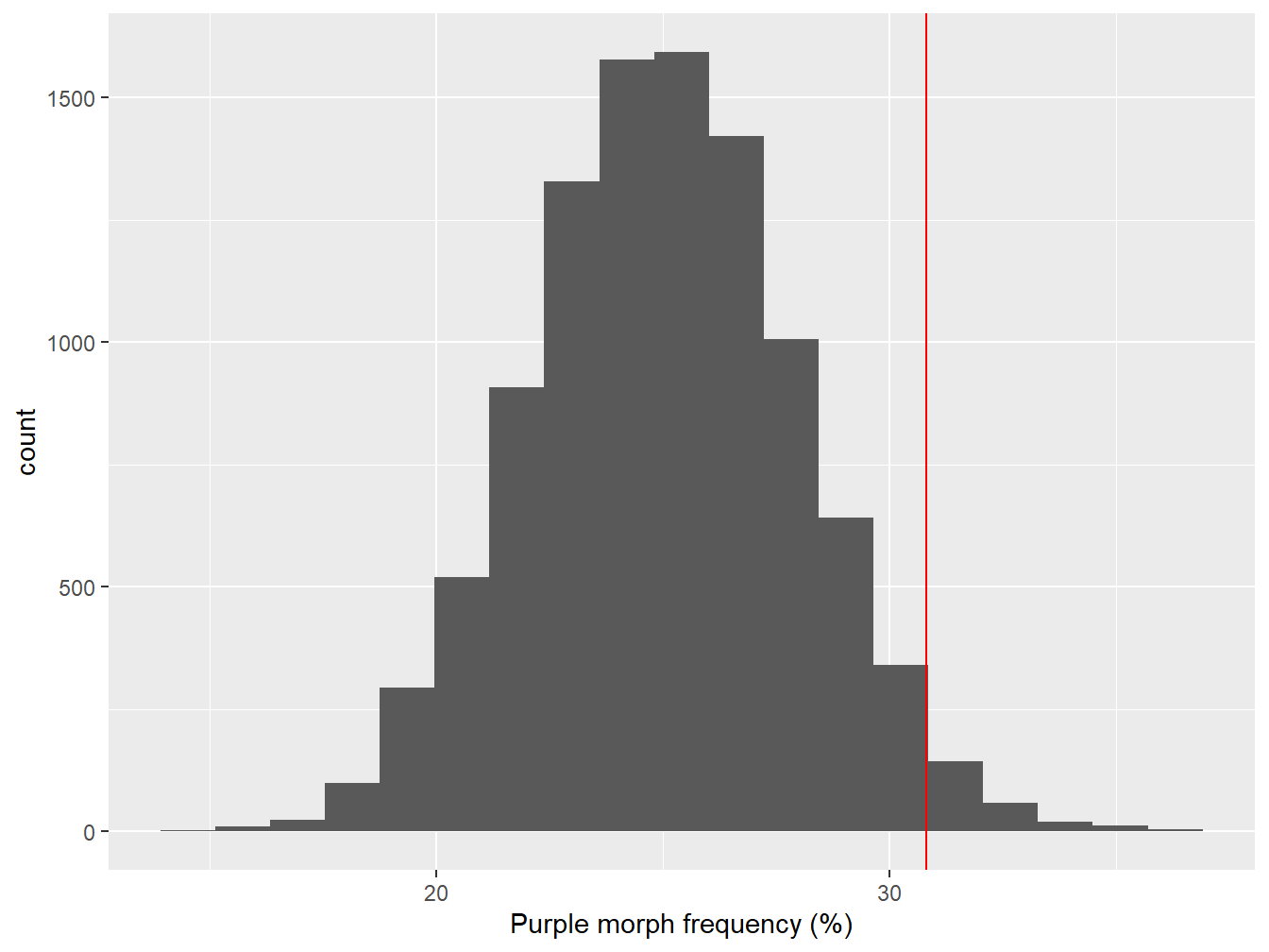
Figure 7.2: Sampling distribution of purple morph frequency under the null hypothesis
The red line shows where the point estimate from the true sample lies. It looks like the observed purple morph frequency would be quite unlikely to have arisen through sampling variation if the population frequency really was 25%. We can say this because the observed frequency (red line) lies at the end of one ‘tail’ of the sampling distribution.
We need to be able to make a more precise statement than this though. We need to quantify how often the values of the bootstrapped null distribution are greater than the value we estimated from the sample. This is easy to do in R:
## [1] 0.0238This number (generally denoted ‘p’) is called a p-value.
What are we supposed to do with the finding p = 0.0238? This is the probability of obtaining a result equal to, or ‘more extreme’, than that which was actually observed, assuming that the hypothesis under consideration (the null hypothesis) is true. The null hypothesis is one of no effect (or no difference), and so a low p-value can be interpreted as evidence for an effect being present. It’s worth reading that a few times…
In our example, it appears that the purple morph frequency we observed is fairly unlikely to occur if its frequency in the new population really was 25%. In biological terms, we take the low p-value as evidence for a difference in purple morph frequency among the populations, i.e. the data supports the prediction that the purple morph is present at a frequency greater than 25% in the new study population.
One important question remains: How small does a p-value have to be before we are happy to conclude that the effect we’re interested in is probably present? In practice, we do this by applying a threshold, called a significance level. If the p-value is less than the chosen significance level we say the result is said to be statistically significant. Most often (in biology at least), we use a significance level of p < 0.05 (5%).
Why do we use a significance level of p < 0.05? The short answer is that this is just a convention. Nothing more. There is nothing special about the 5% threshold, other than the fact that it’s the one most often used. Statistical significance has nothing to do with biological significance. Unfortunately, many people are very uncritical about the use of this arbitrary threshold, to the extent that it can be very hard to publish a scientific study if it doesn’t contain ‘statistically significant’ results.
We just carried out a significance test. It took quite a lot of convoluted reasoning to get there (frequentist statistics is odd). Nonetheless, that rather non-intuitive chain of reasoning underlies all of the statistical tests we use in this course. The good news is that we don’t need to understand the low-level details to use these tools effectively. We just need to be able to identify the null hypothesis being used and understand how to interpret the associated p-values. These ideas are so important that we’ll discuss null hypotheses and p-values some more in the next two chapters.
7.3 Concluding remarks
The bootstrap is a very powerful tool in the right hands, but it is an advanced technique that is hard to apply in more complicated settings, e.g. the analysis of complex experiments. In practice, we will use much simpler methods to analyse our data. We only introduced the technique to illustrate how frequentist ideas can be used to decide whether or not an effect is likely to be present. The details vary from one problem to the next, but ultimately, when using frequentist ideas we…
assume that there is actually no ‘effect’ (the null hypothesis), where an effect is expressed in terms of one or more population parameters,
construct the corresponding null distribution of the estimated parameter by working out what would happen if we were to take frequent samples in the ‘no effect’ situation,
(This is why the word ‘frequentist’ is used to describe this flavour of statistics.)
- then compare the estimated population parameter to the null distribution to arrive at a p-value, which evaluates how frequently the result, or a more extreme result, would be observed under the hypothesis of no effect.